Naked Juice.
Graphic assignment where we redo the outlook of the Naked juice bottle.
Working on the logo, bottle, poster, and ads. Rebranding the compani’s bottle and more. Showing what inspired us and what led us to the final result

Logo.
We got inspired by the current logo of Naked, and decided to use a leaf so the redesign isn’t to fare off the old one. We chose to make the logo more minimalistic style or more “naked” because we thought this was more suitable for the company.


-

Color theme.
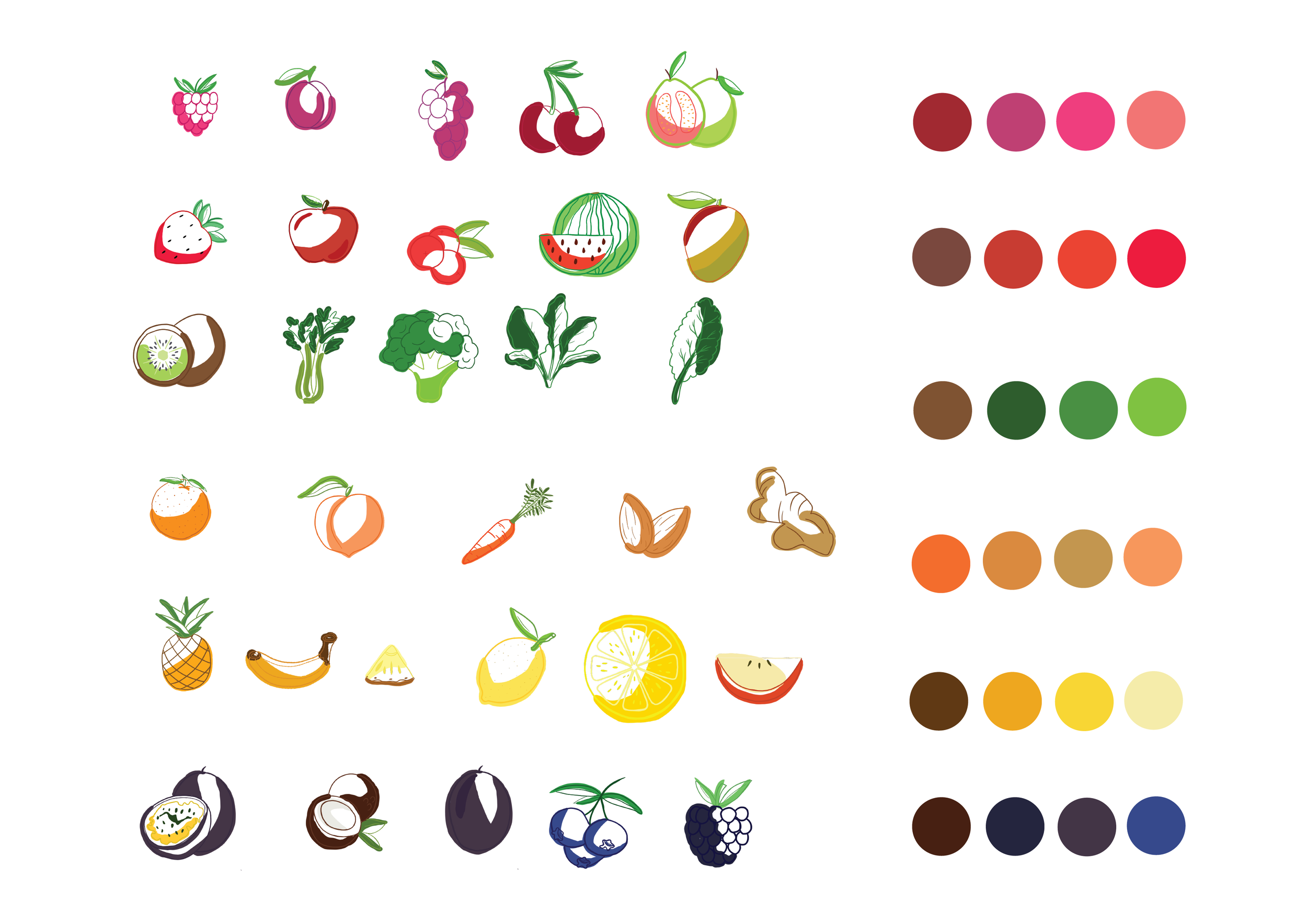
We use brighter and darker shades of the juice itself, to make it match the juice so it gets this “naked” look, it also creates a relaxing color scheme and is pleasant for the eye.
-

Graphic elements.
We use hand-drawn fruits as it is becoming a trend and we think it creates a friendly look for the juices. By having them hand-drawn we can make the texture of the fruits alike so it has a more fluent look at the bottle.


Packaging.
The bottles are recycled plastic and have a square shape so it fits the Pepsi vision in the best possible way. They use square bottles because they can be packed so they don’t have that many emissions during transportation. They use recycled plastic to be more sustainable.
Labels.
We wanted to create a “naked” label to make it suitable for the brand. The label is going to have the color of the juice so it matches and looks “naked” instead of standing out. The front of the label is going to have a transparent logo, and small fruits so it has the “naked” look but also shows the flavor. The fruits are going to “flow” around the bottle. The label also going to have facts and ingredients on it so it follows the low.


